Which looks best?
Hey all!
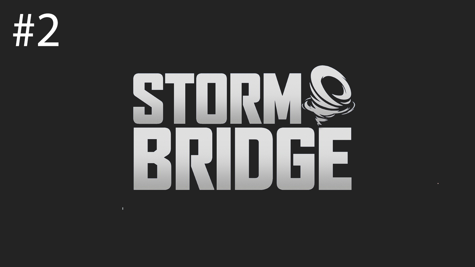
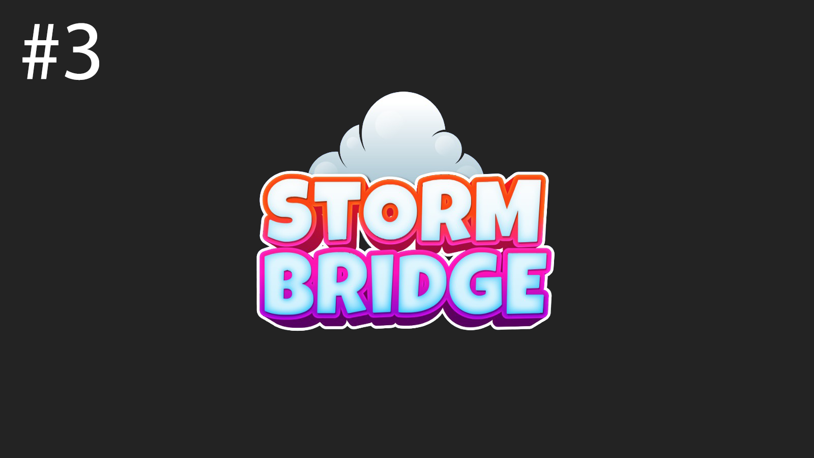
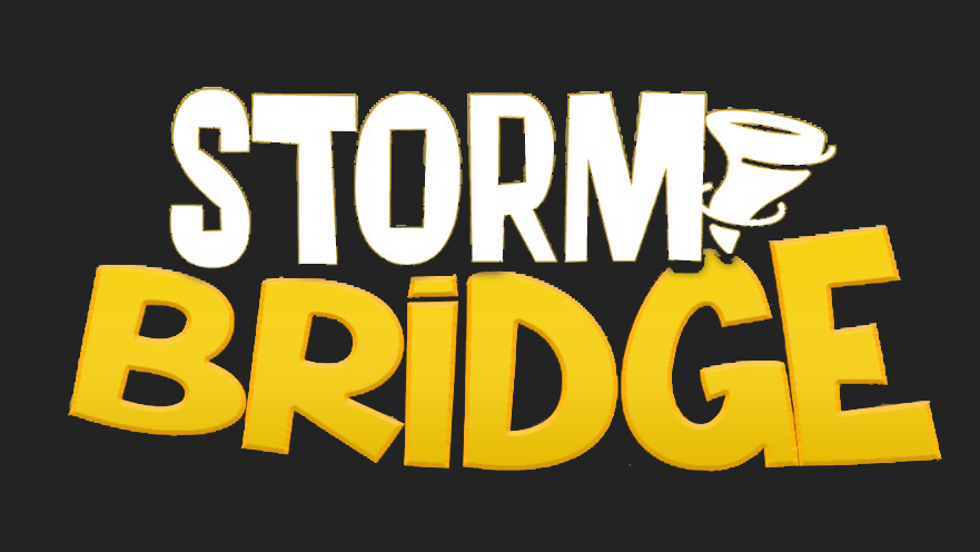
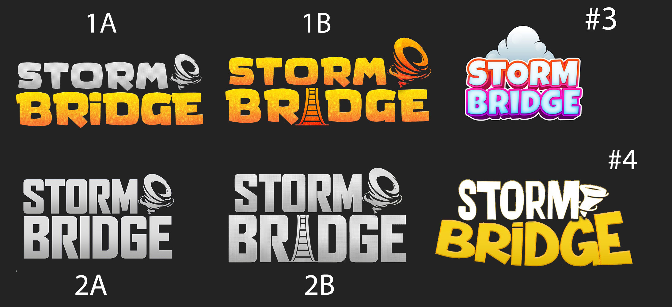
I think the game could use a new logo, and because I'm such an indecisive pleb, I need your help deciding which logo you think looks nicer and that when looked at, makes you want to try the game!
For those unfamiliar with the game, it's a roguelite city builder where you build a bridge settlement while being chased by a storm. It will be released on Steam.
Another thing to note: While the logos shown are against a black background, on Steam it will always be on a wide illustrated art. I have taken out the background so the focus is purely on logos.
Option 1:

Option 2:

Option 3:

Option 4:

This is just my personal first impressions so they might change.
#1 The 'i' in 1B looks a bit like a tower rather than bridge.
#2 boring but is safest. somehow steam logos are pretty simple.
#3 looks like a casual game with no depth, or a children's puzzle game.
Here's them all in one shot.

Here's the game discord if you want to discuss the game:
Get Stormbridge
Stormbridge
Build a self-sufficient bridge settlement while outrunning an impending storm.
| Status | In development |
| Author | YYZ |
| Genre | Strategy, Card Game |
| Tags | City Builder, Colorful, Indie, Management, Real time strategy, resource |
More posts
- v0.73.0 - Out on Steam!Jan 13, 2025
- v0.71.1 - Trading improvementsJan 08, 2025
- v0.70.2 - Skill tree!Jan 07, 2025
- v0.66 - RandomizerDec 31, 2024
- Merry Christmas + 3 days to Steam!Dec 30, 2024
- v0.65Dec 22, 2024
- v0.64 - Stormpiercer buff, Home statueDec 21, 2024
- v0.63 - Long range turretsDec 20, 2024
- v0.62 - Battleships, Sky dolphins!Dec 19, 2024


Leave a comment
Log in with itch.io to leave a comment.